Responsive images using srcset and sizes attributes
Images are lagged behind in the history of the development of web-design. Until quite recently, usage of different images based on screen size or pixel density had not been clearly defined.
But the situation started getting better with advent of an element <picture>. There are two attributes that are key components of responsive images – srcset and associated sizes.
The srcset attribute
The srcset attribute allows us to use a set of source files of image that can be applied in the page’s rendering. To do that, a comma-separated list of images should be provided and user-agent determines which image to display depending on the type and characteristics of the device.
With listing the images we provide two data types for each image
- The path to the image’s file
- The pixel density or width of the image
To set a pixel density we should add x to the density number of the image. For example –
<img src="image-1.png"
     srcset="image-2.png 2x, image-3.png 3x, image-4.png 4x">
It is assumed that the image, set by default with tag src, has srcset attribute equal to 1x.
When the specification of srcset attribute was presented in 2012, we could only use images with different pixel densities, as shown above. However the 2014 specification implemented the definition of width, what allowed us to specify the width for different images.
To specify the image’s width we should add w to the pixel width value of the image. For example –
<img src="image-1.png"
     srcset="image-2.png 100w, image-3.png 500w, image-4.png 1000w">
Only when using the width in the srcset attribute, we can accompany it with the sizes attribute.
The sizes attribute
The sizes attribute allows us to define clearly the size of the image, which should be used depending on media conditions.
<img src="image-1.png"
     srcset="image-2.png 100w, image-3.png 500w, image-4.png 1000w"
     sizes="<media condition> <width>,
            <media condition> <width>,
            <optional default image width>">
Media conditions
A media condition is not the same as a media-request. It is part of a media-request. It doesn’t allow us to specify media types, e.g. screen or print, but it accepts the conditions, which we usually add to a media type.
Acceptable media conditions can be either –
- Direct media condition, e.g.
(min-width: 900px) - Media condition with denial, e.g.
( not (orientation: landscape) ) - Combination of media conditions, e.g.
(orientation: landscape) and (min-width: 900px) - Selection one of the condition, e.g.
( (orientation: portrait) or (max-width: 500px) )
Width
The specified width can be almost any value of length, e.g. em, rem, pixels or viewport’s width.
However, percentage values are not allowed to avoid confusion. It is recommended to use vw as an alternative if relative importance is required.
Overall view
Bringing together the examples of srcset and sizes –
<img src="image-1.png"
     srcset="image-2.png 100w, image-3.png 500w, image-4.png 1000w"
     sizes="(min-width: 900px) 1000px,
            (max-width: 900px) and (min-width: 400px) 50em,
            ( not (orientation: portrait) ) 300px,
            ( (orientation: landscape) or (min-width: 1000px) ) 50vw,
            100vw">
If media condition is true, the user-agent will choose which image to display in mentioned size based on different sources, defined in the srcset attribute.
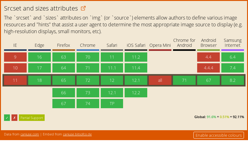
Browsers’ support
The srcset and sizes attributes are quite well supported by current browsers:
For browsers that don’t support the described attributes, an image is extracted from the regular src attribute and displayed properly for all media conditions.