Responsive images using srcset and sizes attributes
Images are lagged behind in the history of the development of web-design. Until quite recently, usage of different images based on screen size or pixel density had not been clearly defined.
But the situation started getting better with advent of an element <picture>. There are two attributes that are key components of responsive images – srcset and associated sizes.
The srcset attribute
The srcset attribute allows us to use a set of source files of image that can be applied in the page’s rendering. To do that, a comma-separated list of images should be provided and user-agent determines which image to display depending on the type and characteristics of the device.
With listing the images we provide two data types for each image
- The path to the image’s file
- The pixel density or width of the image
To set a pixel density we should add x to the density number of the image. For example –
<img src="image-1.png"
     srcset="image-2.png 2x, image-3.png 3x, image-4.png 4x">
It is assumed that the image, set by default with tag src, has srcset attribute equal to 1x.
When the specification of srcset attribute was presented in 2012, we could only use images with different pixel densities, as shown above. However the 2014 specification implemented the definition of width, what allowed us to specify the width for different images.
To specify the image’s width we should add w to the pixel width value of the image. For example –
<img src="image-1.png"
     srcset="image-2.png 100w, image-3.png 500w, image-4.png 1000w">
Only when using the width in the srcset attribute, we can accompany it with the sizes attribute.
The sizes attribute
The sizes attribute allows us to define clearly the size of the image, which should be used depending on media conditions.
<img src="image-1.png"
     srcset="image-2.png 100w, image-3.png 500w, image-4.png 1000w"
     sizes="<media condition> <width>,
            <media condition> <width>,
            <optional default image width>">
Media conditions
A media condition is not the same as a media-request. It is part of a media-request. It doesn’t allow us to specify media types, e.g. screen or print, but it accepts the conditions, which we usually add to a media type.
Acceptable media conditions can be either –
- Direct media condition, e.g.
(min-width: 900px) - Media condition with denial, e.g.
( not (orientation: landscape) ) - Combination of media conditions, e.g.
(orientation: landscape) and (min-width: 900px) - Selection one of the condition, e.g.
( (orientation: portrait) or (max-width: 500px) )
Width
The specified width can be almost any value of length, e.g. em, rem, pixels or viewport’s width.
However, percentage values are not allowed to avoid confusion. It is recommended to use vw as an alternative if relative importance is required.
Overall view
Bringing together the examples of srcset and sizes –
<img src="image-1.png"
     srcset="image-2.png 100w, image-3.png 500w, image-4.png 1000w"
     sizes="(min-width: 900px) 1000px,
            (max-width: 900px) and (min-width: 400px) 50em,
            ( not (orientation: portrait) ) 300px,
            ( (orientation: landscape) or (min-width: 1000px) ) 50vw,
            100vw">
If media condition is true, the user-agent will choose which image to display in mentioned size based on different sources, defined in the srcset attribute.
Browsers’ support
The srcset and sizes attributes are quite well supported by current browsers:
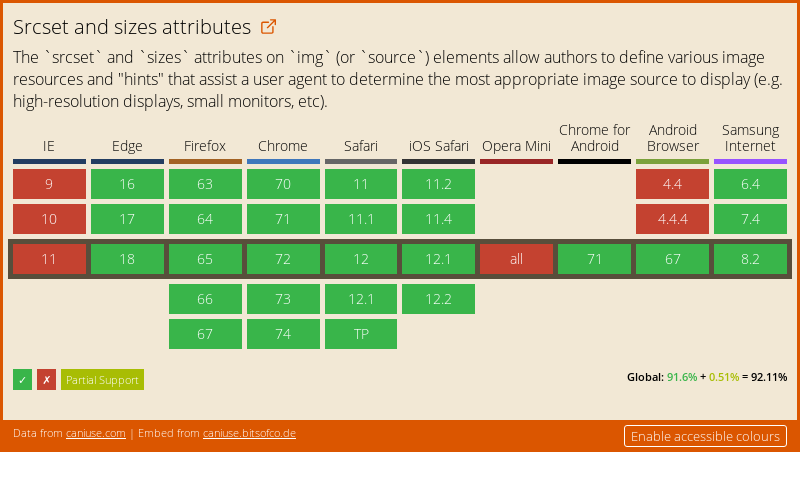
For browsers that don’t support the described attributes, an image is extracted from the regular src attribute and displayed properly for all media conditions.
WebP format: how to use and why do you need this
WebP is an image format developed by Google in 2010. It was created as an alternative to the PNG and JPG formats. With the help of WebP you can create images of much smaller size than traditional JPG and PNG formats without degrading the image quality.
Why do you need WebP?
WebP is a really useful and valuable image format, because it offers both performance optimization and diverse functionality. In contrast to other formats, WebP supports both lossy and lossless compression, as well as transparency and animation.
| WebP | PNG | JPG | GIF | |
| Lossy compression | + | + | + | – |
| Lossless compression | + | + | + | + |
| Transparency | + | + | – | + |
| Animation | + | – | – | + |
Even with this diverse functionality, the WebP format provides significantly smaller file sizes than its alternatives. During the comparative study of these image formats, it was found that WebP compressed images with quality losses were on average 30% less than JPG ones, and WebP lossless images were on average 25% less than PNG ones.
How to convert images into WebP
There are several tools for easily converting JPG, PNG and other file formats into WebP.
Online converters into WebP
- Squoosh – a tool for converting and comparing image formats from Google
- Online-Convert.com – online converter
Command Line Tools for WebP
Cwebp is the most popular command-line tool for converting images into WebP format. Once installed, it can be used to convert formats with various options, such as quality level, desired file names, and others.
# cwebp -q [quality] [input_file] -o [output_file]
cwebp -q 75 image.png -o image.webp
Node Tools
imagemin, and its plugin imagemin-webp is the most popular Node.js library for converting images into WebP format.
Below you can find an example of script that converts all PNG and JPG image files contained in a folder into WebP format.
/* convert-to-webp.js */
const imagemin = require('imagemin');
const webp = require('imagemin-webp');
imagemin(['*.png', '*.jpg'], 'images', {
  use: [
    webp({quality: 75})
  ]
});
You can use this script through the command line interface or using various build tools.
node convert-to-webp.jsSketch
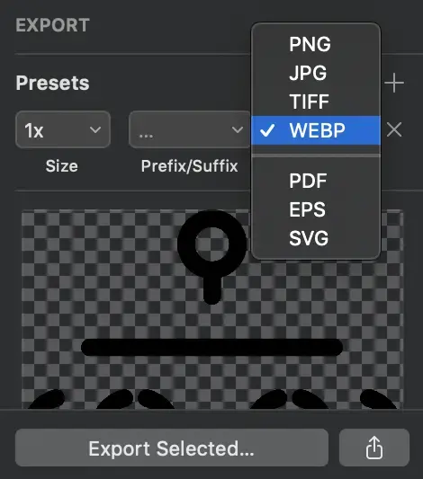
The Sketch is used to export any element already converted or created in WebP format.
How to use WebP on the site
At the moment of this review being written WebP’s image format was supported by ~75% of browsers used worldwide.
Data on support for the webp feature across the major browsers from caniuse.com:
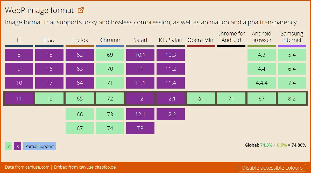
Even though this is quite a lot, it is not enough to miss making a fallback for unsupported browsers. Otherwise, some of the users will not see the image.
Backup images can be created with the help of the element <picture>. This is an HTML5 element that allows us to use multiple source files for a single image.
<picture>
    <source type="image/webp" srcset="sunset.webp">
    <source type="image/jpeg" srcset="sunset.jpg">
    <img src="sunset.jpg" alt="Sunset Image">
</picture>
To provide an alternative image source, we use the <source> element inside the <picture> element of the element. The <source> element has attributes to define the type of the image and the instructions concerning which type to use:
type: MIME type of source file;srcset: Path to the image file. You can use several files to display one image of different sizes (see Responsive images using srcset and sizes attributes);sizes: List of sizes of each source file (see Article above);media: Media request to determine which source will be used to display the image.
In addition to the <source> elements, the code should also contain the usual <img> tag, as a reserve for browsers that do not support several file formats through the <picture> element.
Why SVG was the most popular format in 2018
In 2018, SVG was in great demand. Over the past few years, more and more users prefer to use this format, but in 2018 the popularity of SVG has reached its peak.
Many users appreciate SVG for a number of advantages, such as high-resolution displays, minimum loading time, etc. Although some people believe that the transition to SVG is problematic – it is not.
SVG format is very easy, there are no difficulties in its usage. Simply convert existing files to SVG format. Additional manipulation is not required.
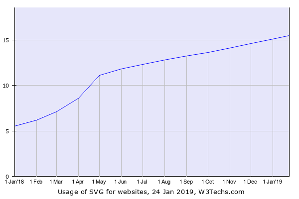
the percentage of websites using SVG January 2018 – January 2019
SVG is ideal for working with websites
Mozilla gives this the following definition:
SVG is a language created in XML format for vector graphics markup. Its basic principle is similar to HTML markup, but the main difference is that SVG allows you to use additional elements and effects to more accurately define details of an image. SVG is designed to work with graphic elements rather than text content. The most simple elements that you can create using this format, you can include the <circle> and <rect>. To make more complex features, you can use the colour transformation function with the transformation matrix <feColorMatrix>, animate some graphic elements <animate>, or apply a mask <mask> to the image.
People who are professionally engaged in the design of websites, note the following advantages of using this image file format:
- The capability to create simple images using a text editor, and to create more complex using the software like Adobe Illustrator;
- SVG text is accessible;
- Writing scripts and design SVG does not require much effort;
- SVG makes it possible to work with any image size.
This image format is widely used in browsers, as well as has a high degree of compression.
The main drawback of using SVG is that users who do not have sufficient skills to work with such an image format can be confronted by difficulties in the early stages of working with the format, and outdated browsers simply do not perceive this format.
Application in the design
The benefit of SVG is that this image format is suitable for creating absolutely any kind of image, no matter whether it is an animated picture, background or logo. This format is absolutely universal. That’s the beauty of it.
In any case, where the use of vector format is acceptable, SVG can be used to create any element. This format can be an alternative to popular formats such as JPG, PNG or GIF.
Rules for using a vector format
It is possible that you will need to use a large amount of vector format. And since SVG does not depend on the resolution, you can be sure that regardless, your image will look good anyway.
When using SVG, it’s very nice to be aware of the fact that one doesn’t need to step back from your usual workflow to implement them. In case you work with any other illustration software, it doesn’t really matter. The principle of operation of these programs is absolutely similar, except for the final export. Most likely, you will need to turn a text element into outlines in Illustrator, but this technique is used by many users.
But when preparing an image in SVG format, you should pay attention to the following. To keep the file size as small as possible, make sure that all the items you don’t need are removed. (You need to clean the pasteboard).
SVG and search engine optimization
SVG is still designed to be used by more experienced designers. The actual formatting of the SVG text, so search engines can better read the image.
You also have the ability to add the necessary information to the image, but the amount of this information is quite limited. SVG gives you the ability to create images that can be easily searched by search engines, and just as easy to download. Google uses the index system to search for SVG files, even if they are embedded in HTML.
Ease of format
If we compare SVG with other files based on vector graphics, we can say that SVG is code. Of course, if I may say so…
When saving images in SVG format, check the file size to avoid problems with them in the future. Unlike PNG images, the size of which can be Increased by adding transparency, the size of SVG depends on the number of fills and paths that are used when working with the illustration.
If the SVG exceeds the allowed size, you may need to convert this format to JPEG, PNG or BMP. The fact is that many professionals working in the field of design use several formats as if combining them; but be prepared for the fact that you still have to work more with SVG formats.
Ease of editing
If earlier, when creating various logos and icons you worked with vector graphics, then there will be nothing new for you in this case.
But if you first had to face SVG, we are sure that you will like it. In order to make some changes to the picture, you just need to change a word or coordinates in the editor. And everything is ready! It is impossible to come up with something simpler than this.
Create animations and still illustrations
Unlike other image formats, with SVG you can create not only still images, but also animated ones. The principle of operation for all formats is the same.
A number of these qualities make this format more popular among designers. You don’t need to learn how to use the new image creation tools, because SVG already has the necessary.
Conclusion
On the basis, we can conclude that SVG is not in vain gaining popularity among users, and it was the most used format in 2018. Practicality is the main advantage of SVG.
SVG is perfect for people who work with high-density images because vector graphics, in this case, is the right solution. There are no problems with scaling, and you don’t have to be anxious about pixelation. SVG allows you to create any kind of image, from icons to animation. You can also safely use this format when creating a website design.
And if you have not worked with SVG before, we advise you to start using it right now!